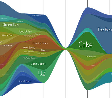
Above is a small part of my music listening history as reported to last.fm over the last year and a half. Time is plotted left to right, overall number of tracks by the width of the shape, and the colors represent individual artists. I used LastGraph3, which if given your user name will make a set of graphs from your data.
If you click on the image above, you'll see the full history. It looks like I go through periods where I listen to a fair bit of music, and then stop, and start again. I think there's a fair amount of smoothing of the data. I think my history would look even more jagged without smoothing.
I like plots like this because they show multidimensional data using colors and shapes in an intelligent way. Of course the classic example is Minard's famous depiction of Napoleon's 1812 Russian campaign. I think everyone should have to learn how to make good plots, and understand how to read one. When I was a TA, I constantly had to remind students the point of making graphs - I think nearly all of them felt it was busy work rather than a way to organize and visualize data; a way to recognize a physical effect.
Just like significant figure errors (I am bothered enough by those to contact newspaper reporters: I've done it in the past), I cringe at the sight of misleading or poorly organized graphs. The worst offenders tend to use Excel, whose plots are instantly recognizable as probably being garbage. I also dislike the USA Today charts and many plots seen on the various network evening news shows. Too much artistic influence from graphics artists (no offense K.P.!), and not enough substance.
