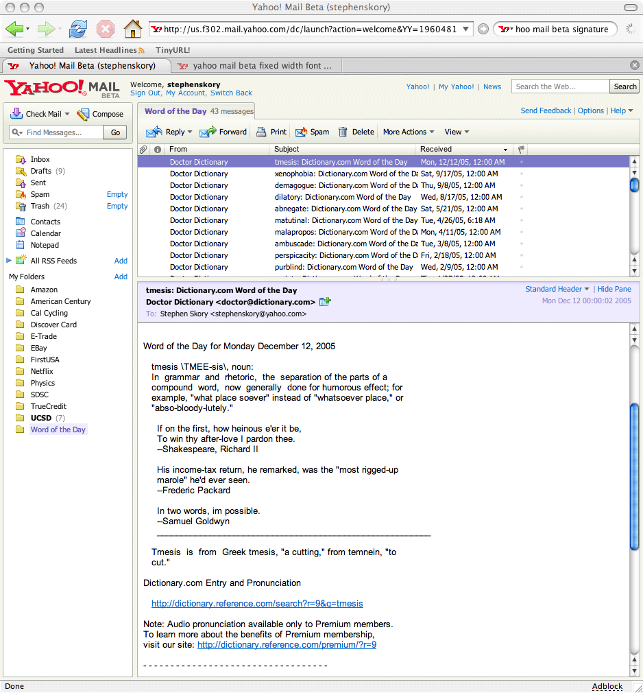
I just got added to the list of Yahoo! Mail users who get access to the new Beta interface. All in all, I actually like it, even compared to Gmail's interface. For a while now I've been hoping that Yahoo! would give users IMAP access to their email, so I could use a good email client with my own computer at home, but still have access to all my messages anywhere. This interface just might curb that desire. It has Gmail's trick of simple keyboard shortcuts, but also has drag-and-drop ability for messages, RSS feeds and cute icons. One really neat feature is you can have multiple "tabs" open. Tabs can have messages you're composing, reading, or your inbox. Very often I am writing a long email when I want to send a quick note to someone else. With tabs it should be very painless.
This new interface has the potential to be just as good as many email clients. I however, have some complaints:
-
Please, please, please use fixed-width fonts. Email is not supposed to look good. If I wanted it to look good, I'd send a PDF. There are many reasons why fixed-width fonts are a good idea, foremost being ASCII art (of course!). My signature has a cute little cyclist guy nestled between my name, email & web address. With a variable-width font it looks terrible.
But seriously, though, if I ever wanted to email myself some sort of crontabbed system log, the unix-style of formatting with spaces between items would completely not work. Please, Yahoo!, at least give us the option to have fixed-width fonts. I know I could fix that using site preferences on my browser, but that's not very practical on every single computer I use.
-
When replying to messages, I like to reply to each of the person's points by quoting what they wrote, and then writing below that. Example:
```
What do you think about the design? Too much? I think less red and more blue.
Yeah, I agree. Red is pretty much the worst color you could ever choose. ```
The way the beta does it is it puts the replied to message with about 4 carriage returns above it AND puts your signature above the message. This means that if I reply to a person's message the way I like to, the first thing my message will have is my signature. Dumb!
-
As far as I can tell, right now there is no way to differentiate between what I've written and what I'm quoting. Usually there are the greater-than signs (>), but in beta there aren't. Some email programs put colored lines. I'm asking for something to tell them apart, Yahoo!, are you listening? Don't take a step backwards!
-
The signature doesn't seem to recognize carriage returns. That's just silly. I have a three-line signature that gets turned into one very long line. Even if I didn't have ASCII art, it would butcher a simple signature.
-
Fix the bugs! Editing a replied-to message is buggy. Before I can delete any of the copied message (the one I'm replying to) I need to type something at the very top. The interface could be faster, too. But then again, old Yahoo! mail isn't that fast, either.
I'm sure I can think of more things to gripe about it in the next few days. I'll add to this list as I use it.