Don't worry about the physical meaning of the two plots below:
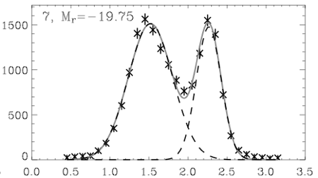
Taken from Baldry et. al. (2004),figure 3 (plot 7).
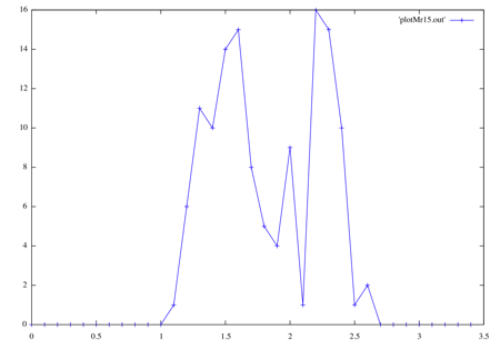
My plot of entirely fake data that means almost nothing.
Just notice that the two peaks are pretty much in the same places on both graphs, 1.5 and 2.2. The first graph shows physical data (stars) and a double-Gaussian fit (light solid line). The second graph is the result of my using Monte-Carlo fitting to make entirely fake data using the first curve. The real graph has over 10,000 items to make that smooth distribution, while with only about 100 items Monte-Carlo is already starting to look like the real thing. Of course, it will take much more items to capture the smoothness and the "long-tail" on each end.
I just wanted to share because the whole thing I wrote, which includes a simple function integration (for normalization), worked on my first try.