Workplace Ethics & The Little Guy
While I was in college, I took a part-time job working on a small internal library website for the Forest Service. The pay wasn't great, but it was fairly easy and I learned a bunch about website administration.
Since I was an employee of the service, at one point I was required to watch a video on workplace ethics and fill out a questionnaire after watching it. I'm all for workplace ethics. It's just this video was about being fair in granting federal farm loans. I now know that if a woman in a wheelchair comes in to borrow money for her farm I shouldn't reject her based on her sex & disability. The same goes for brown people, stupid people, annoying people, bad actors and lepers (*).
The federal government doesn't do anything unless they have to. So obviously, somewhere, sometime, some bigoted ass-face loan officer rejected a loan to a qualified person because she voted for Clinton. Years of litigation later and this computer jockey in Albany, California, has to waste over an hour of his time learning to not be an ass-face when granting loans.
Fast forward to today: I'm now a highly valued employee of the University of California. The UC system has had a bunch of executive compensation scandals in recent years where ethics rules weren't followed. As a graduate student, I obviously have lots of power when it comes to:
- Hiring/firing employees;
- Demanding perks from the administration;
- Granting these shady deals;
- Leaking things to the media;
- Ruining the budget and driving admissions fees up.
This is why I'm going to watch an ethics video soon on how to not do all of the above. This response is totally out of proportion. Of the 230,000 employees of the UC system, only a small fraction are responsible for or capable of these gross ethics violations. Me and my fellow little guys shouldn't have to waste any time on this crap. The big wigs should instead have to attend a week-long course on ethics taught by a former Catholic school nun. Yes, she'd be an excellent wielder of a ruler.
You can look forward to future commentary when I actually see this video. Stay tuned.
(*) I'm making the lepers part up.
more ...My Bowl Rankings
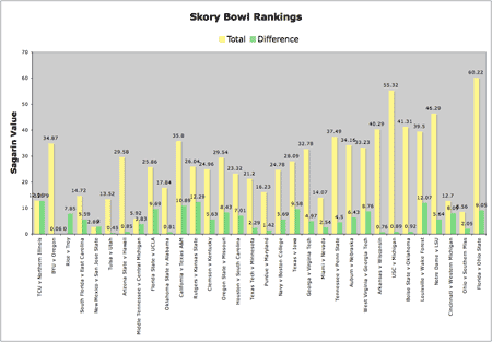
Now that the full bowl schedule is out, I've done some rough analysis, ranking the bowls by their computer ranking. Since the human rankings don't go as deep as all the various bowl-bound teams, I've used the Sagarin computer rankings to do my mathematics. Simply, I added the Sagarin number for both teams, and also took the difference between the two teams. The first is supposed to roughly gauge the quality of the bowl, and the second the competitiveness of the two teams.
I've lowered the totals (in true USA Today front page style), so the worst bowl, the R&L Carriers New Orleans Bowl between Rice and Troy, has a value of zero. The bowls are arranged in order, with the national championship on Jan 7 on the far right.
In my opinion, the bowls should get better towards and beyond January 1. New Years Day has always been the day for the best bowls -- the Rose Bowl, for example. This graph makes it clear that bowls don't get better in any kind of pattern. In particular, the Pioneer PureVision Las Vegas bowl between BYU and Oregon is way too early for its quality. And the two bowls right before the National Championship (a grand canyon of stink in the graph above), the International and GMAC bowls, are in fact two of the worst bowls of the season.
My team, California, plays in the Holiday bowl on December 28 against Texas A&M. There are 11 bowls after that until there's a bowl of better quality (the Outback bowl between Tennessee and Penn State on the first). By far the best bowl of the season will be the Rose Bowl (between USC and Michigan), which has quality only second to the National Championship, but has a much smaller difference between the teams.
There are all kinds of people out there complaining about the BCS, arguing for a playoff system. I'm on my soapbox asking for the schedule to be changed. Awful bowls don't belong in January, and good bowls don't belong in Mid-December. Especially when my Bears play way too early!
more ...Red Shoe – 1996
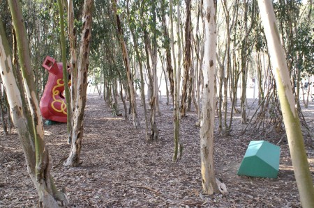
Red Shoe, by Elizabeth Murray, is situated near La Jolla Vista View in the far South corner of campus. This is probably the least-visited of all the Stuart Collection items. Not only is this item blocked by two large parking lots from the active part of campus, it is buried in a grove of Eucalyptus trees. It is one of my last Stuart Collection items for this reason.
It is made up of cedar and paint using a technique similar to boats. It is open so one can look inside and see its simple construction. The heel is high in the air indicating that the person wearing this shoe would be taking very long steps, and this would be the trailing foot. There is a yellow shoelace tangled on the side, but there is only one eyelet. There are odd, angular rocks littered near the shoe which, frankly, I don't understand.
I have strong feelings about this piece. I don't like the randomness of it (rocks?) because it's half-hearted. If you're going to be random, you should go all the way. Here, Murray has mixed children's fables with Dahli-like solid object manipulation. It's just not well done in my opinion.
more ...Fun Pics 2
I saw this out on a bike ride recently. Just how am I to cross at the intersection without going past the closed sidewalk?
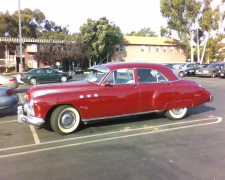
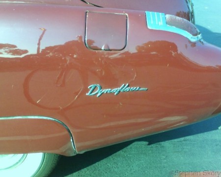
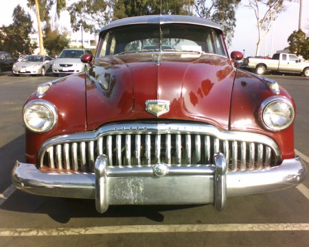
Someone parked this awesome Buick Eight in the parking lot next to my building on campus. Here is more information about the Buick Eight, which featured an inline 8 cylinder engine and an early automatic transmission called Dynaflow. Here's a great print ad for the car on Plan59, a for profit repository of historic American print advertisements. The car doesn't change color from one picture to the next, it's my cell phone camera trying to white balance the image. The perspective photos have more accurate color than the close-ups.
I want portholes on my Volvo.
more ...La Jolla Income Bell Curve
I got a mailer today from a publication, the La Jolla Blue Book, which lists local businesses. They're taking some demographical statistics of their readership (which are the people they send the book to -- for free). I had no intention of filling it out, until I saw this line:

Let me emphasize: I cannot truthfully check any of these boxes. What's astounding here is they didn't even consider that someone might make less than $25,000 and live in La Jolla, but they spend a whole checkbox on $1+ million bracket.
My new Krups waffle maker (thanks Melissa & Mom!) comes with a warranty card, with a similar demographic-culling intention.

Since Krups sells their products nation-wide, they have to cover all income ranges, which are quite a bit different than La Jolla. I'm thinking maybe I'll fill out the LJ Blue Book form now, but make my own box so I don't have to lie about my income. That'll show 'em poor people live here too!
more ...Most Time Ago
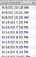
I have a playlist on my iPod that automatically updates to include the 25 songs that have gone the longest without me listening to them. (Huh. Can you think of a better way to put that?) I made it some time ago on the idea that songs would migrate there, and then I'd look at the list and listen to something neglected. It doesn't actually happen that way. Today I noticed that the songs at the top of the list had been unlistened to for over three years! I think the time would have been much longer if it hadn't been for an iSight-firewire related hiccup that forced me to reformat the iPod sometime in mid-2003.
I bought my 20 GB 2nd Gen iPod in January 2003 at the Macworld show. According to the Wikipedia page linked previously (a dose of NaCl crystal, of course), since I last listened to these songs, 65.5 million of the total 67.6 million iPods have been sold. Put it another way -- these songs have sat unused on my iPod longer than most people have even had their iPods.
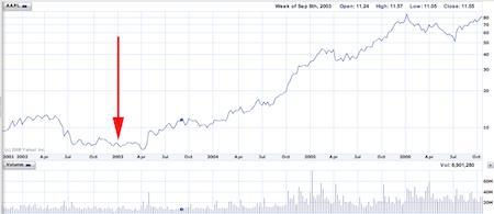
Below is a graph of Apple's stock prices over the last five years, since the introduction of the iPod. When I first heard the name, "iPod," I actually thought it was pretty stupid. Perhaps that's why I'm not in marketing. The red arrow shows when I bought my iPod, when Apple's stock was below $10. As always, Apple's death was right around the corner. Coincidentally, I purchased a good deal of Apple stock around this time, which I have yet to sell.
What were these songs neglected for so long? Well -- a few of the longer and slower Dave Matthews songs and some of Stevie Wonder's poorer licks.
more ...Fun Pics
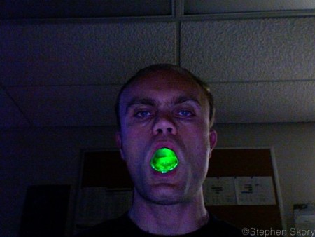
I've got green mouth! Where's medical science to save me? (It's just a green laser pointer.)
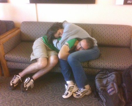
This doesn't look too comfortable, in my opinion. I guess they're madly in love because I'm not sure I could stick with this contorsion very long. And what's up with his right hand?
Vegitables doing the nasty. Maybe I'll get banned by the p0rn filters now. Sweet.
more ...Cell Panorama
Check out the panorama I made using my cell phone camera. I would have though the distortion would have been just awful, due to the pinhole lens, but it's not too bad. You'll notice that there are some strange pinkish hues in the sky. Is MCAS Miramar releasing pink dye into the sky for this weekend's air show? My more logical guesses are: A.) dirt on the lens; II.) something funky with the CCD; or 3.)something funky with the JPEG compression algorithm of the cell phone. A.) is likely always the case, but I suspect that II.) and 3.) are also quite likely.
more ...Yahoo! Mail Beta still stinks… less
Three months ago I wrote that Yahoo! Mail Beta still stinks. I said that Yahoo! had fixed two of my five main quibbles with their newest email interface. Sure, they fixed two, but they were the ones I cared least about.
Lo and behold, Yahoo! came out with an updated version of Mail Beta a month ago, and more recently my server farm received the update. Let's see how Yahoo! fares this round!
-
Fixed-width fonts. Huzzah! Numbah one gets addressed. This is big. Fixing this almost is enough for me to start using Beta every day. But only almost. Yahoo!, you get a nice green check:

-
Message replying format. Nope. Nothing new here. Same, lame behavior as before. Give us some freedom, Yahoo!. Stop putting the minority with good etiquette down! This earns you a Big Red X, and red is never a good color for anything.

-
Message quoting. Nope, again. There is still no way to differentiate the message I'm replying to and what I've written. Another BRX.

Yahoo!, you're getting beat up, down, left and right by Google. They just took YouTube out from under you this week! Shape up!
more ...$408,510
I came across this transcript of the Chancellor (link broken) of UC San Diego, Marye Anne Fox, answering students questions during an online chat. The questions were not very interesting. Missing is a question about the vowel shortages in Bosnia, and why she's not helping them out, because she's got some extra "e"s to lend.
I guess in the chatroom format, complete answers aren't really called for. Sometimes I think she hits it just right:
beebop> Hey, Marye quick question: I was just wondering, what is your favorite sandwich?
MA_Fox> that's easy. a cheeseburger
On the other hand, sometimes she doesn't answer at all, in full politician mode:
fitfreak> I'd like to know more about the upcoming vote to raise fees to help pay for Division 2 scholarships. Why is this necessary?
MA_Fox> I encourage you to get involved with student govt so that you may weigh the pluses and minuses of expanding athletic scholarships.
And there's the people with their little problems:
maricket> I'm a cheerleader on campus, I am wondering why we do not receive priority registration. We are now considered "athletes" and I think we do more than our part to contribute to UCSD's spirit and athletic program. Having practice at least 12 hours a week plus games, rallies, and fundraisers, I believe that we deserve a chance to plan around those events with that priority registration. What do you think?
MA_Fox> I was not aware of this issue and will discuss it with the VC for Student Affairs.
I wonder how MA_Fox would have answered if maricket was a cheerleader off campus?
Overall, I get the distinct feeling that she's not really earning the $408,510 she's being paid as the Chancellor. Honestly, do her answers strike you as concise and to the point? She really doesn't know what students care about. If she was being verbally grilled by a thesis comittee, she'd be flunked. And since this is a university, I think that's a fair measure of her performance.
more ...